
STONE HARBOR POST CARD EXAMPLES:
THE FORERUNNER TO TODAY’S DIGITAL PHOTOSHOP
SOFTWARE PROGRAMS
The purpose of this brief article is to provide five examples of Stone Harbor post cards from the 1920s and 1930s that have had the images altered in ways so as to change or enhance the overall effect of a photographic image and the subject being depicted.
Today I think it is safe to say that our current photoshop methods and capabilities are not only extraordinary but have even been revolutionary insofar as the significant influences they can have on shaping our perceptions and opinions. Perhaps like many things in life, the primary motivation may well be the proverbial bottom line, simply making money, influencing thinking or getting votes of approval.
The alteration or perhaps the manipulation of images today is quite commonplace to say the very least and I am sure it is done now as it has been done in the past for any number of reasons. Obviously our current technology and means are more sophisticated today. Because our lives are so inundated with countless images that have been designed for a very specific purpose, we either do not know the difference or we simply do not have the time, interest or need to question it. This condition may have at an earlier time employed certain techniques more familiar to us such as airbrushing, cut-and-paste, etc. Call it what you like.
So here’s a question for you. Did you ever want to enliven or correct a picture, any picture, for some reason? If so, what might your motive have been and what would that have actually entailed? Perhaps that certain photo of you might have had an unseemly or unsuitable frown and not a pleasing smile as you might have preferred? Surely you can think of a multitude of reasons why you might embark on such a course of action to make a better and more likable image of something or someone.
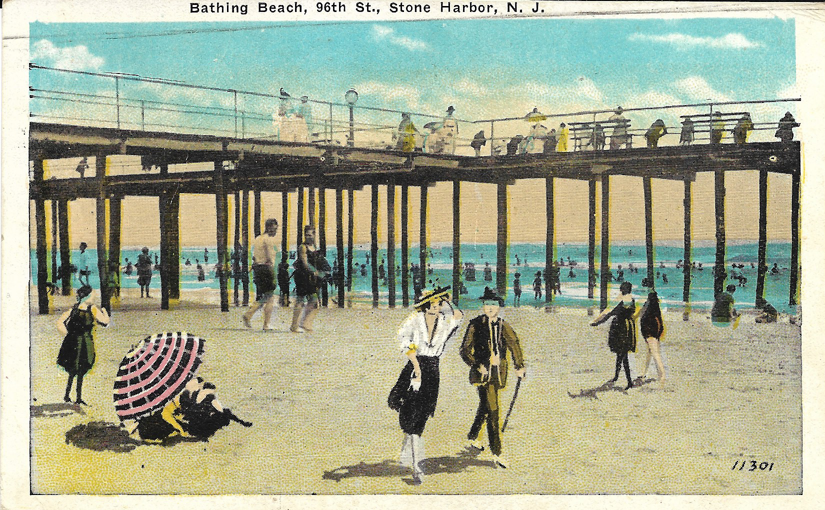
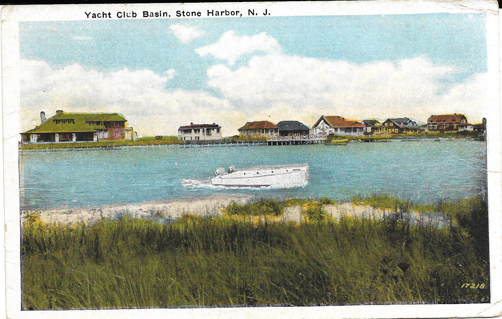
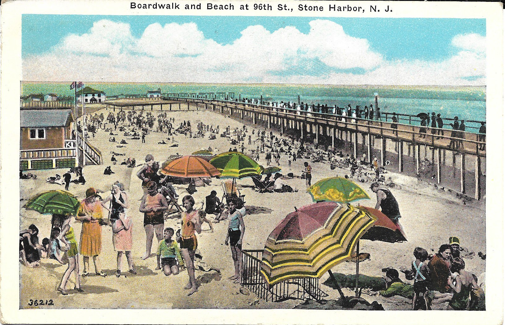
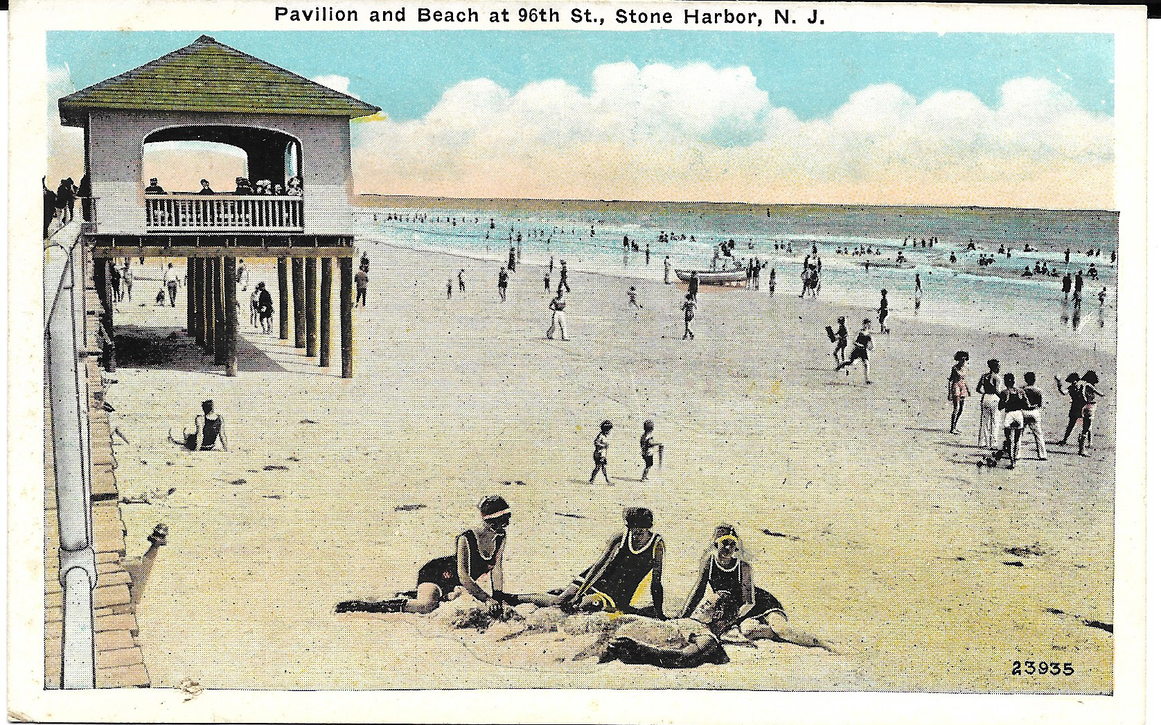
Interestingly, post card manufacturers have been doing just this for many years. Occasionally certain modified images are more glaringly obvious than others. For example, post card makers have added billowy clouds to a summer sky when the scene called for it. Or they may have changed the muddy brown color of a certain river to more pleasing color of blue. Maybe that prominent boardwalk in a certain South Jersey town was destroyed in a hurricane in the 1940s resulted in a surgical removal of that very structure from an older post card image. Or just perhaps that view of the Yacht Club Basin did not have a moving motor boat in the foreground and aesthetics suggested placement of a craft was appropriate for that very scene. And the view of the three girls on the 96th Street beach having fun covering up a young man on the beach with sand surely just might capture some attention if those four individuals were placed first and foremost in another certain image. Whatever the reason(s), the printers made these very changes because they could and it made sense to create a more pleasing or attractive image. That’s just logical, right? Perhaps you just might spot some alterations on your post cards.
This brings us now to the five Stone Harbor post cards presented here showing crowds of people at the beach with the boardwalk either in the background or situated off to the side of a given picture. Now I would ask you, the viewer, to look very carefully at all five of these post cards. What do you see and what is your overall impression of each of these images? Does everything look natural and conform to size in relationship to the surrounding areas and persons? Consider the most obvious spatial relationships and perspectives in each view. In fact, if you really look closely, you can see how there is a handmade look about one image in particular and even a somewhat primitive quality about it that we can see utilized a cut-and-paste collage technique with rather crude seams showing and easily visible. The size of people in relation to others suggests that some people and even umbrellas were inserted into both the foreground and even the background for an added but nevertheless noticeable effect. On one such card look particularly close at the water and the beach area. Simply put, some things and elements in these post cards just appear to be out of sync with the world. Expressed another way, one might conclude there is an unnatural juxtapositional placement of the subjects shown! Are you able to discern what I am referring to?
Just for the sake of added information, you might be interested in knowing that based on the inscription printed on the message/address side of each, all five of these post cards were produced by and sold by David Troxel who you may recall was the proprietor of a variety store located at 96th Street and 2nd Avenue during this time period. Might there have even been a sales incentive for these very images to have been altered in the ways you have observed here and moreover who would have been responsible for creating these interesting changes – the manufacturer, the seller, or both? I am sure that over time store owner David Troxel learned which particular scenes and post card images were the most popular among vacationers and his decision-making to market post cards was probably based according to that premise.
In conclusion, the thrust of this short article with accompanying post card images is simply to point out that as the quote attributed to Phaedrus states, in life “Things are not always what they seem!” This might be sound advice to remember the next time we are booking that hotel or rental unit reservation online.